Published in: IEEE UEMCON 2023 — Best Paper Award
 To help climate scientists and non-technical users alike access decades of satellite-derived ice velocity data, I collaborated with NASA’s ITS_LIVE team to rebuild their glacier data visualization tool from the ground up. The original tool was based on Jupyter Notebooks, which required launching a new kernel and performing significant server-side computation for every user. This architecture imposed serious scalability limitations and high hosting costs.
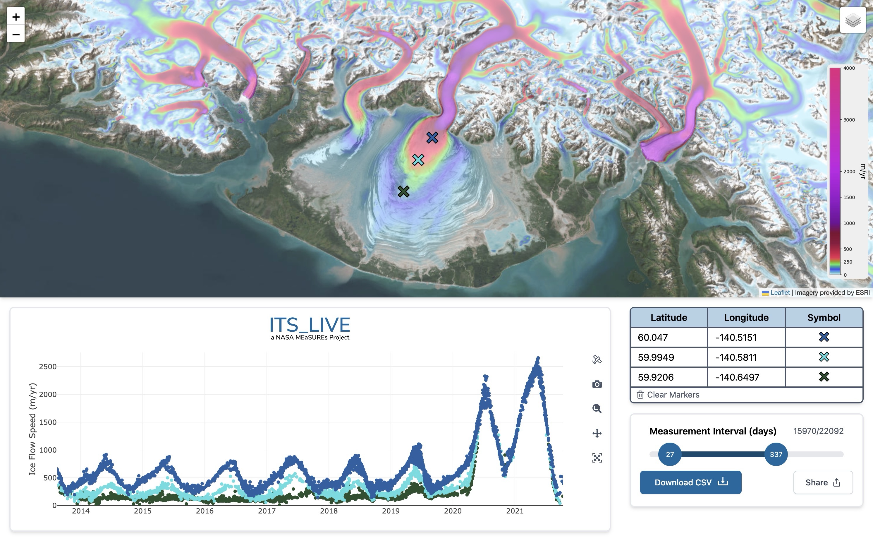
I developed a fully client-side JavaScript application that enables interactive exploration of the ITS_LIVE dataset directly in the browser. By shifting all compute to the user’s device and directly accessing the dataset from AWS S3, Mappin eliminated the need for an intermediary data server. This architecture not only made the tool significantly more scalable but also reduced dramatically reduced latency. Time-to-first-byte (TTFB) dropped by over 120x, and accessibility/performance audits using Google Lighthouse showed a 40% improvement, with scores consistently above 92 across performance, accessibility, and best practices.
Built with React, Leaflet, and Zarr.js, Mappin handles on-the-fly coordinate projection, finds the closest available velocity time series, and renders interactive, shareable charts via stateful URLs. It’s a responsive single-page app (SPA) designed to work across devices and network conditions. Thanks to its static build, it can be distributed via CDNs or hosted directly alongside the data in an S3 bucket, drastically simplifying deployment and operations.
Mappin now serves as a more accessible entry point to NASA’s global cryosphere data, and lays the groundwork for future public-facing climate research tools. You can explore the ice flow history of Alaska’s Malaspina Glacier here.